ECOWIN
One small step towards sustainability.
Help people be more sustainable without going out of their comfort zone and motivating them to continue contributing
Problem Statement
Even after they want to contribute towards the environment, the user has a perception that their activities either are meaningless and wasted or these known activities require a lot of effort by going out of the way and knowledge to contribute to the environment.
Lack of awareness and dependable information for knowledge.
The false perception that contributing would need them to go out of their way.
Lack of time for big contributions.
Sustainable products and initiatives are not easily accessible.
Challenge
Designing an MVP prototype for a product that can help users contribute and record their activities towards environmentally conscious efforts.
Solution
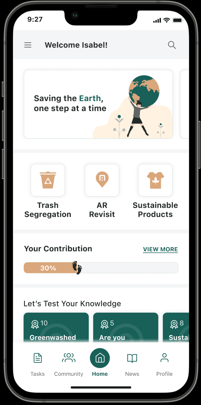
Ecowin - The application that helps contributing to the environment simple accessible and motivating.
Onboarding
Signing up and setting preferences for customised user experience.
Tasks and Challenges
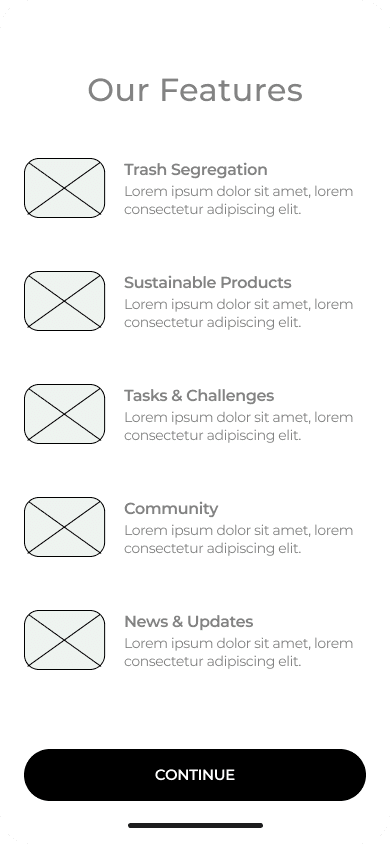
Perform our easy tasks and challenges which help you contribute towards the environment and also earn rewards.
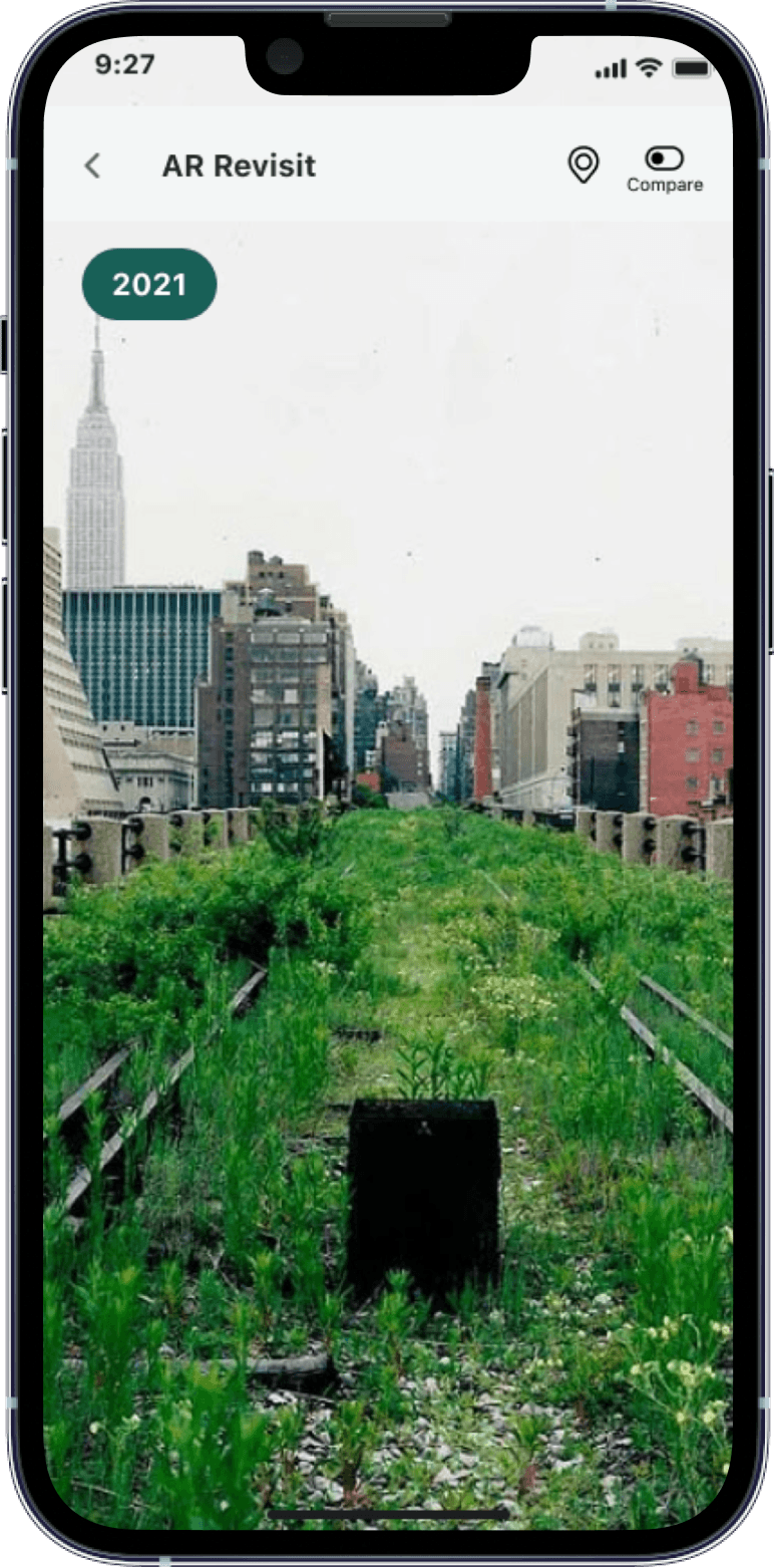
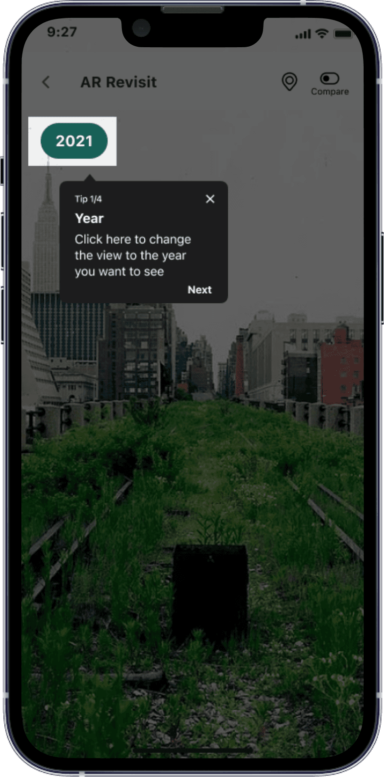
AR Revisit
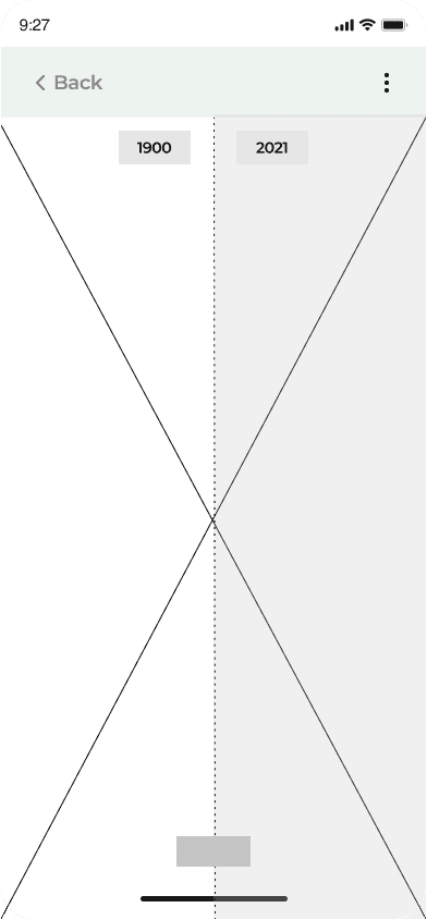
Check out how a place looked like in the past. Compare it with the present scenario to understand how climate change has affected the locations.
Sustainable Products
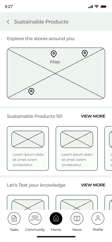
Explore shops and articles related to sustainable products. Attempt quizzes to test your knowledge and earn rewards.
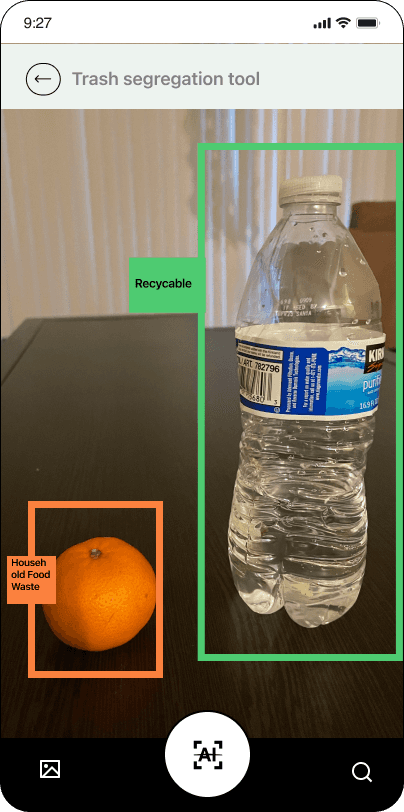
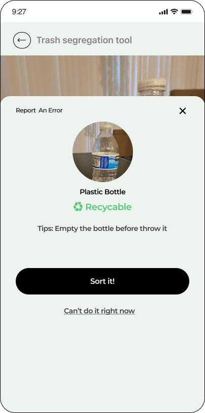
Trash Segregation
Segregate your trash correctly in two easy steps.
News and Updates
Get latest updates in the form of articles, videos and blogs related to environment.
Key Learnings and Future Scope
Working on this project taught me:
Share-n-learn atmosphere considering the varied backgrounds of team members
Importance of the iterative process
Advantages of the in-person group sessions
Interpersonal and intrapersonal growth
Attention to detail
Adding the future scope features will further aid users in becoming more environmentally conscious. Following are a list of features that we would like to incorporate in the next design stage of Ecowin:
Community
Carbon Footprint calculator
Smooth linking with other websites
Collaborate with organisations and corporations
Let’s Dive Deeper into My Design Process

Phase 1 : Research and Analysis
The objective for research was to answer the following questions:
What stops people from contributing to the environment?
Sustainability knowledge and awareness among people
What do people need that is missing in the domain currently.
What are the needs in the environment and sustainability domain?
Competitive Analysis
We carried out the competitive research to get a better understanding of what is already present in the market,
What do people think of the features in these products?
What works and what does not?
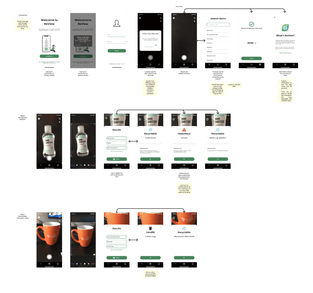
The detailed analysis was done for 11 applications (direct + indirect). We gathered information around reward systems, inculcating habits, environment contribution and sustainability features, community building and buddy system.
Survey
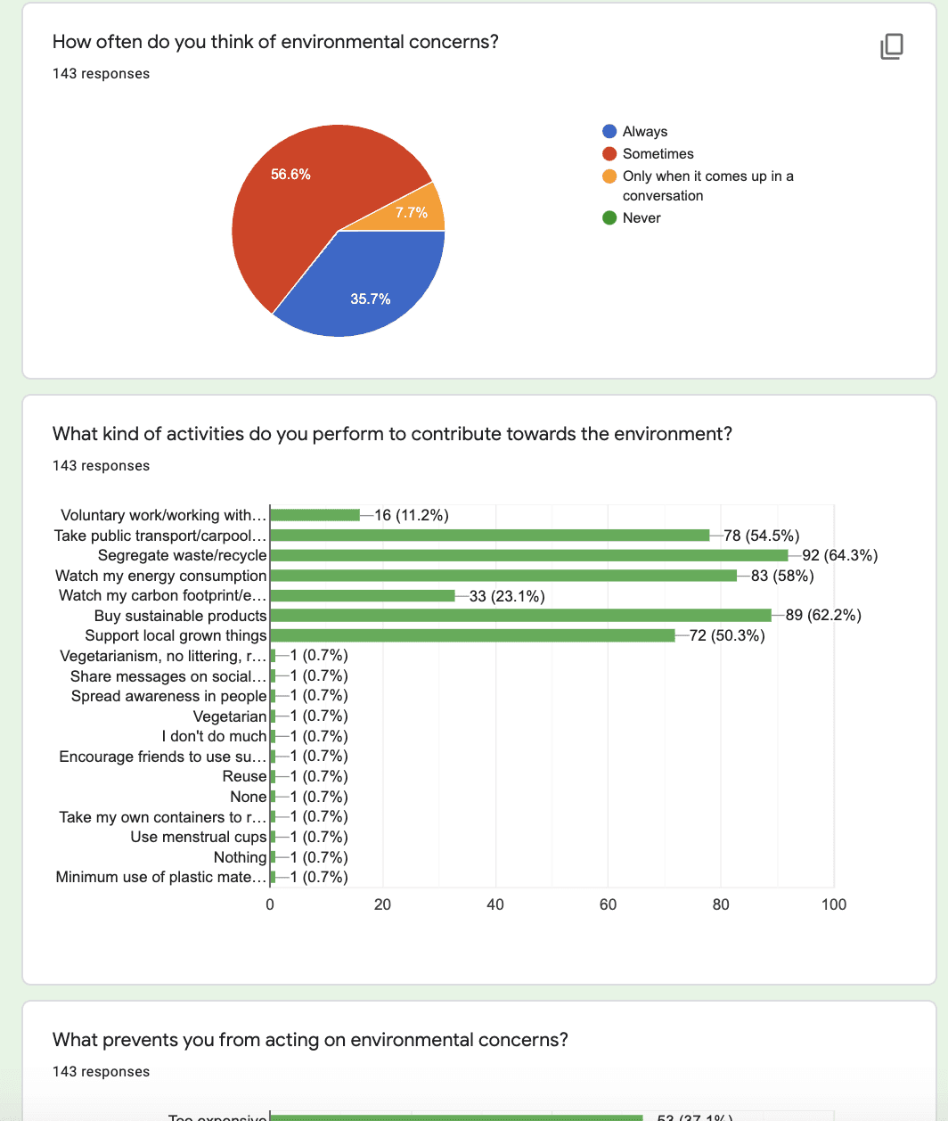
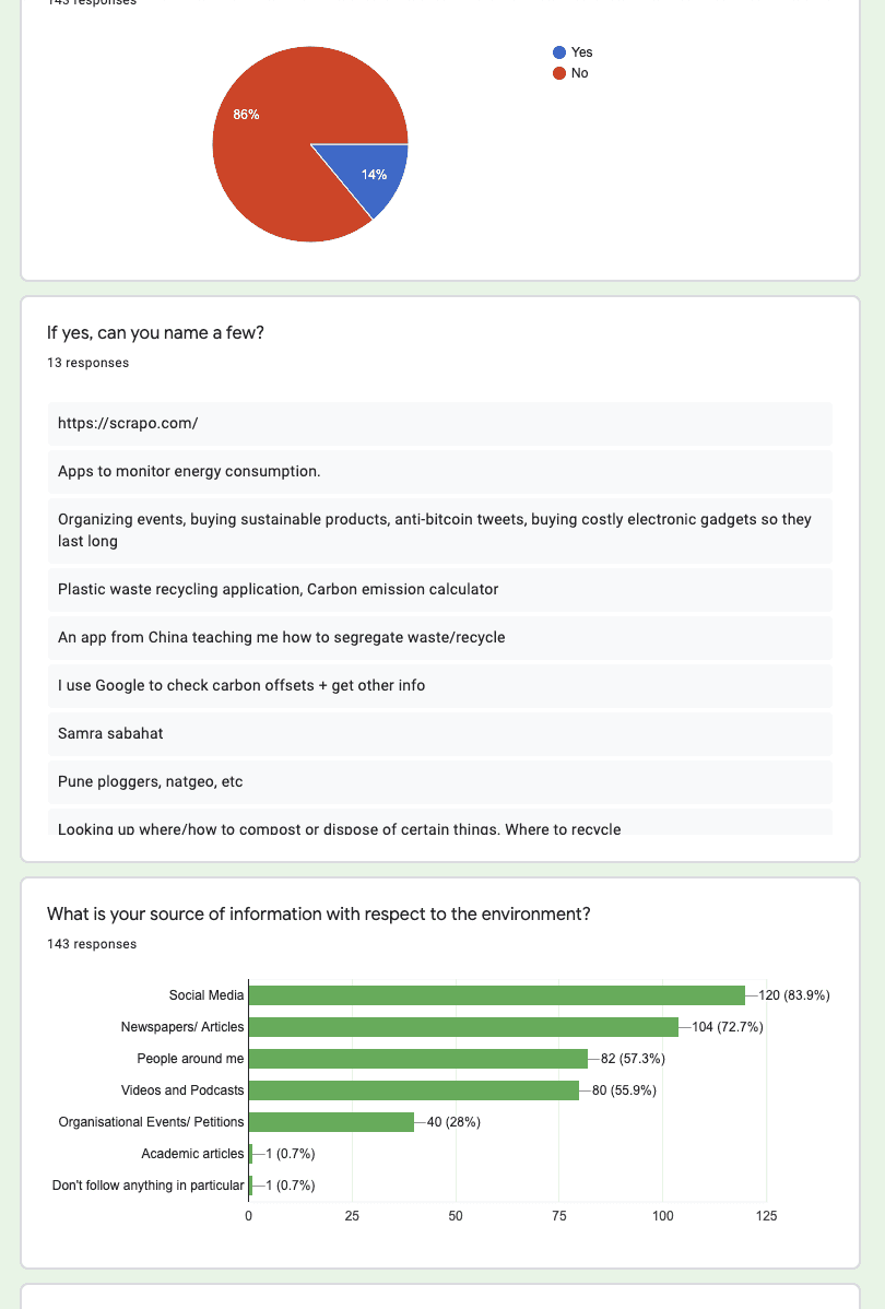
The next step adopted in our process was survey to get quantitative information and overview of the people’s mindset. We also used the survey to confirm speculations & findings from the competitive research. People were asked questions based on environmental contributions, motivations and general sustainability knowledge
KEY Insights:
People feel that sustainability and contributing to the environment need big efforts

People are concerned about the environment but find taking efforts expensive
User Interviews
With the quantifying information we gathered from the survey, we wanted to understand the reasoning behind the people’s responses and get in-depth information. Therefore we conducted 10 in-depth structured interviews
KEY Insights:

If sustainability was convenient people would opt for it more.

People were influenced by peers to be more sustainable.

Being environmentally conscious is expensive

People are not sure if their efforts are mounting to something
Affinity Mapping
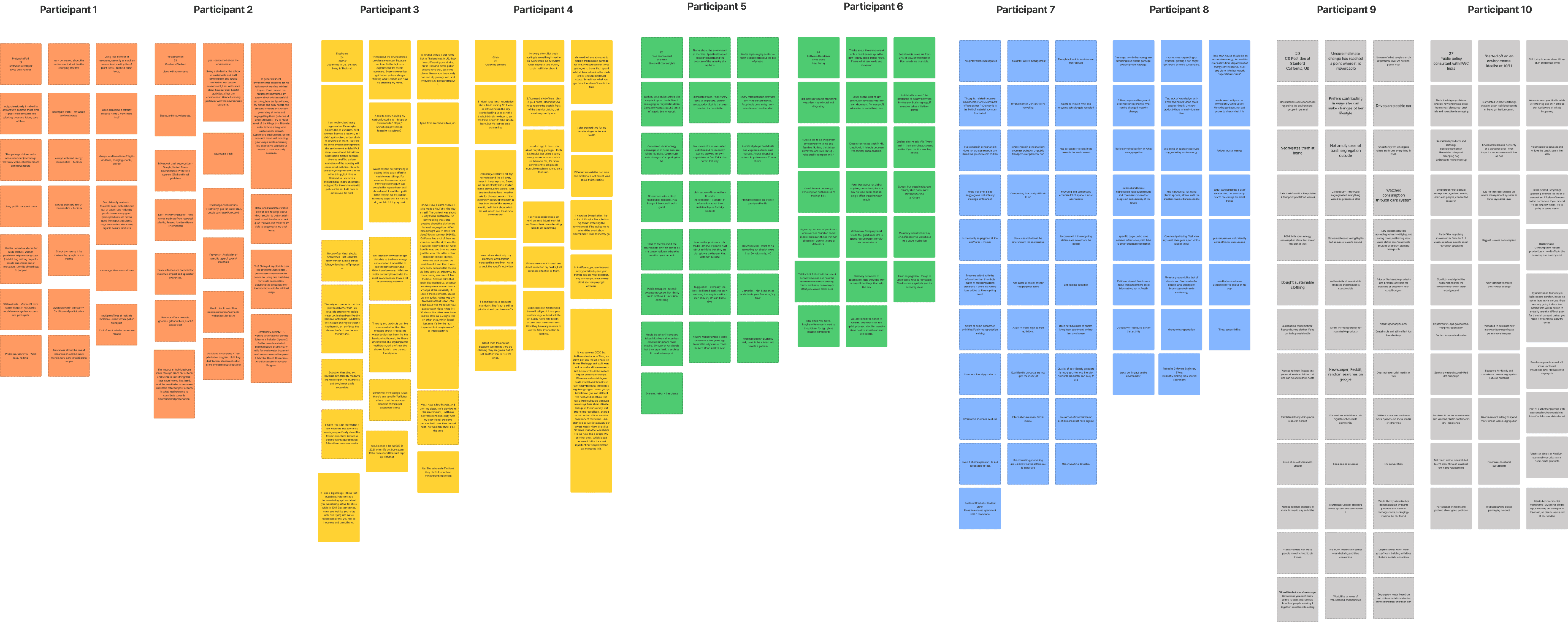
To organise the data gathered into more digestible information we synthesised the information with affinity mapping and the grouped the data into the following major themes:

Waste Seggregation

Tracking Consumption

Actions and Activities

Motivations

Information Sources

Empathy Diagram
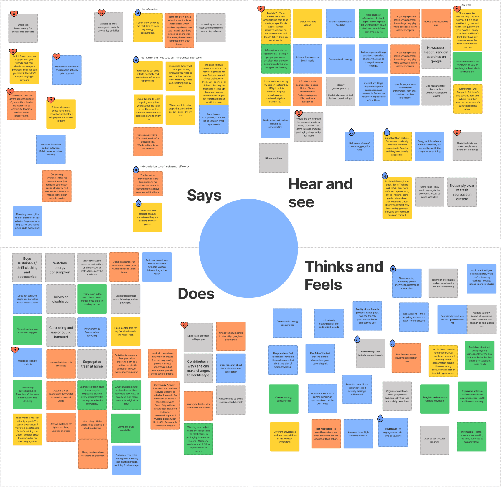
Once we organised the information gathered, to better understand and empathise with the user to create user personas, we organised the data again using an empathy diagram:
This helped prioritise and understand the concerns and issues of the user.
Personas
We created the following two persons interpreting the pain points and gains with the help of previously conducted research.
The personas helped us moving forward to align our thinking as a team.
Feature Prioritisation Matrix
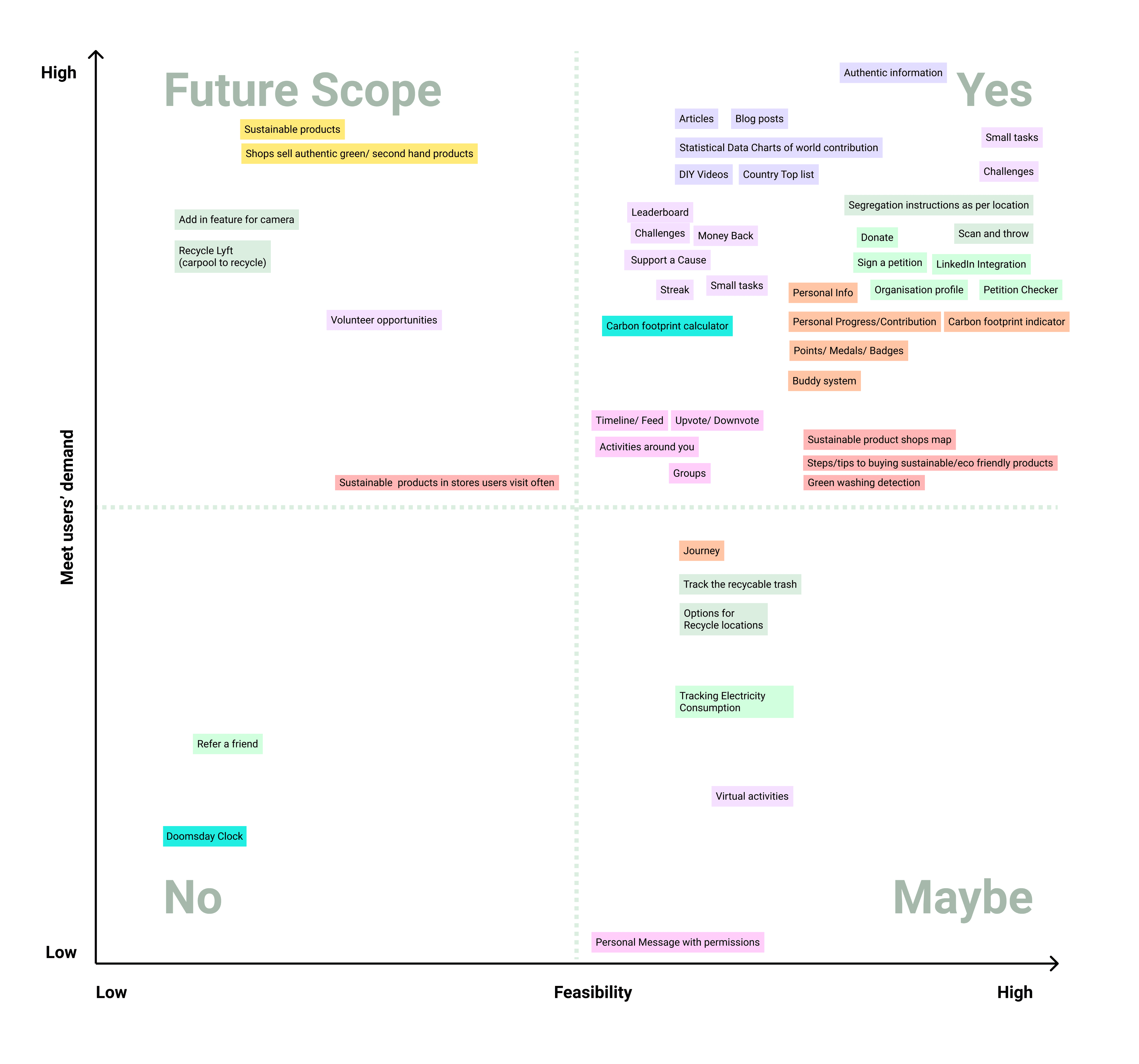
After creating the personas we created a list of features that we would possibly include in the application. We gathered the features from customer recommendation and existing features in application and some innovative features.
This extensive list of features were way beyond our scope of designing in our time frame. Thus we created a feature prioritisation matrix and on the basis of feasibility and customer demand we categorised the features between 4 quadrants: Yes, No, Maybe, and Future Scope.
Phase 2: Design and Testing
During the second phase of the project we undertook activities for ideation, designing and testing.

Ideation and Brainstorming
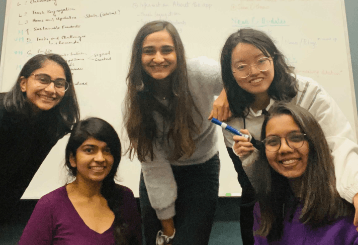
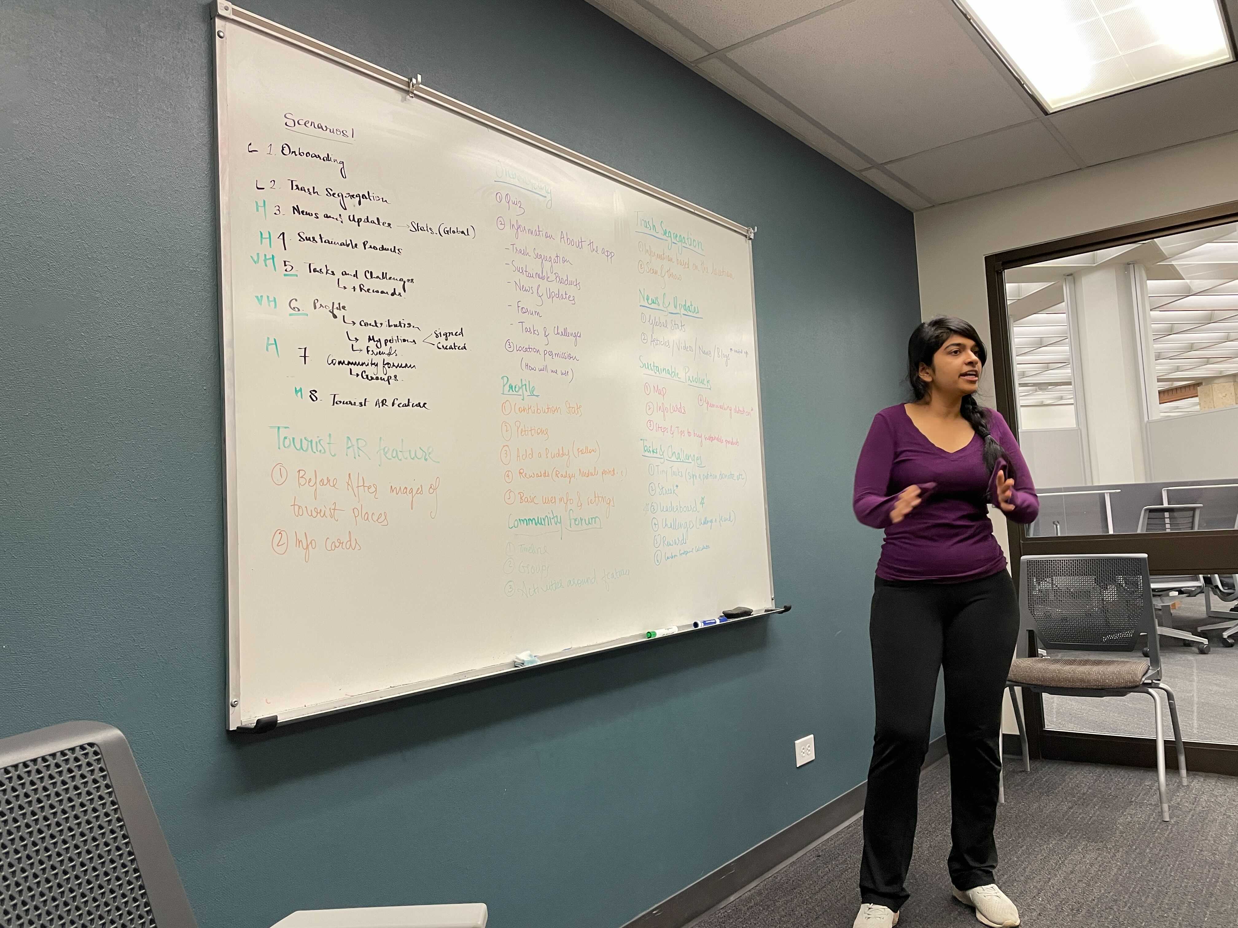
Post creating the feature prioritisation matrix, we still had a lot of features in the yes quadrant. In order to determine a design priority we held a brainstorming session and classify the features under the segregation of main features and sub features that will be grouped together.
We created 8 main scenarios to work with and distributed the features as per the access locations.
Crazy 8
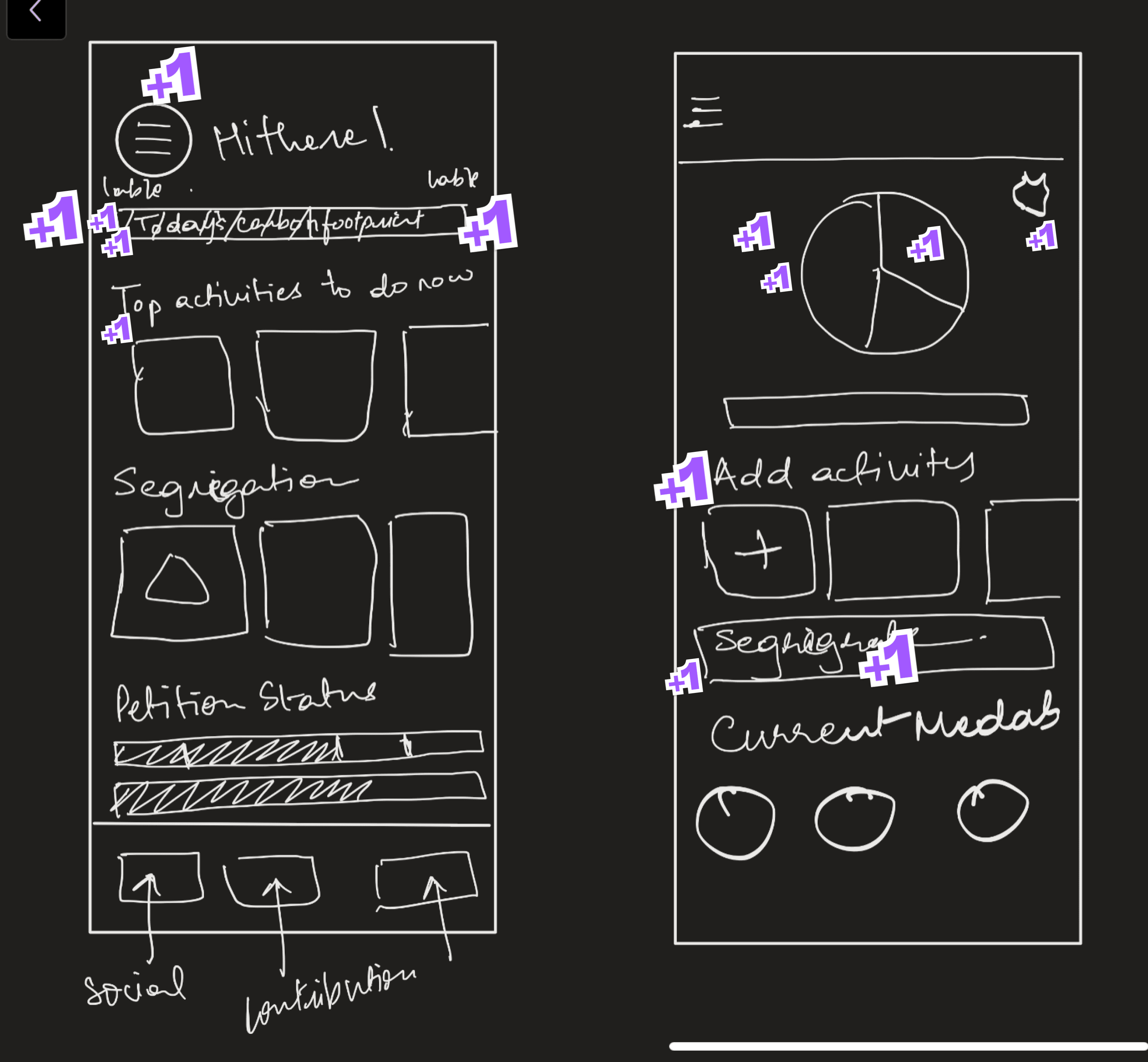
In order to generate multiple design iterations for the solution we adopted a design method close to that of Crazy 8, wherein in a limited time period each team member sketched out multiple designs for the landing page and couple of other main screens. This was followed by an reasoning behind each design and a voting for favourite elements from each design.
Scenarios and User Flows
As there were multiple scenarios we were looking at, it was important to create a flow to understand where these flows intersect with one another.
Wireframing and Pilot Testing
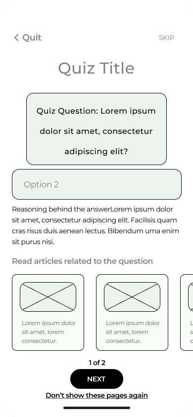
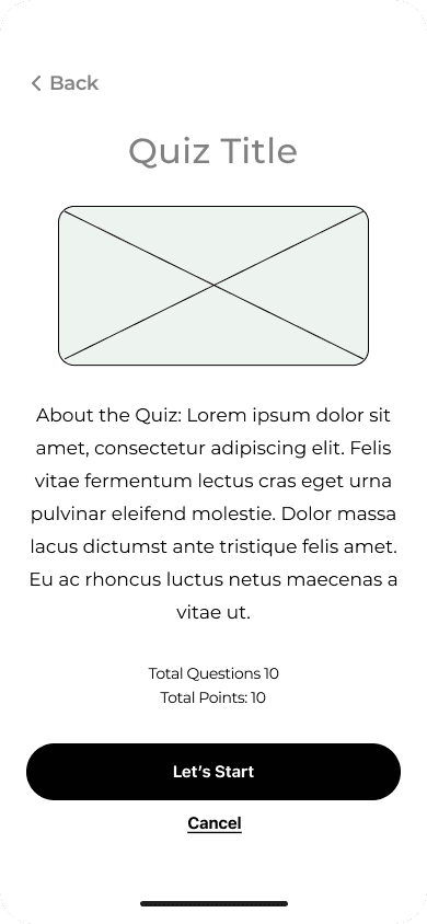
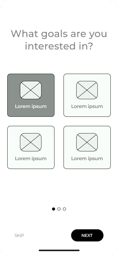
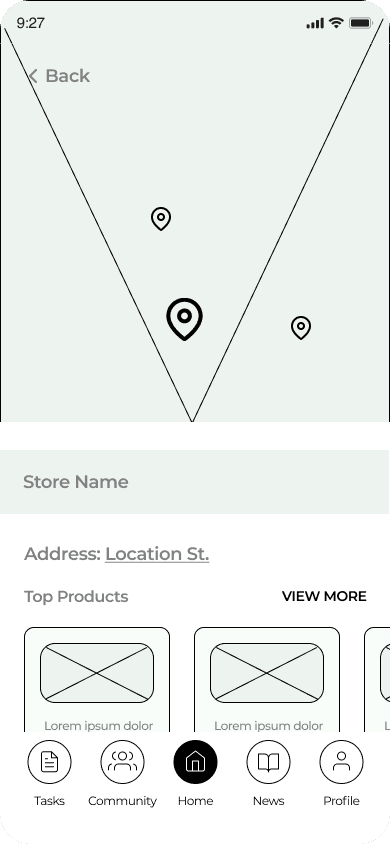
Post creating the user flow we proceeded ahead to design mid-low fidelity wireframes. We conducted an informal pilot test with 10 users on these designs to gather user feedback and make major changes, at an earlier stage.




















Design System
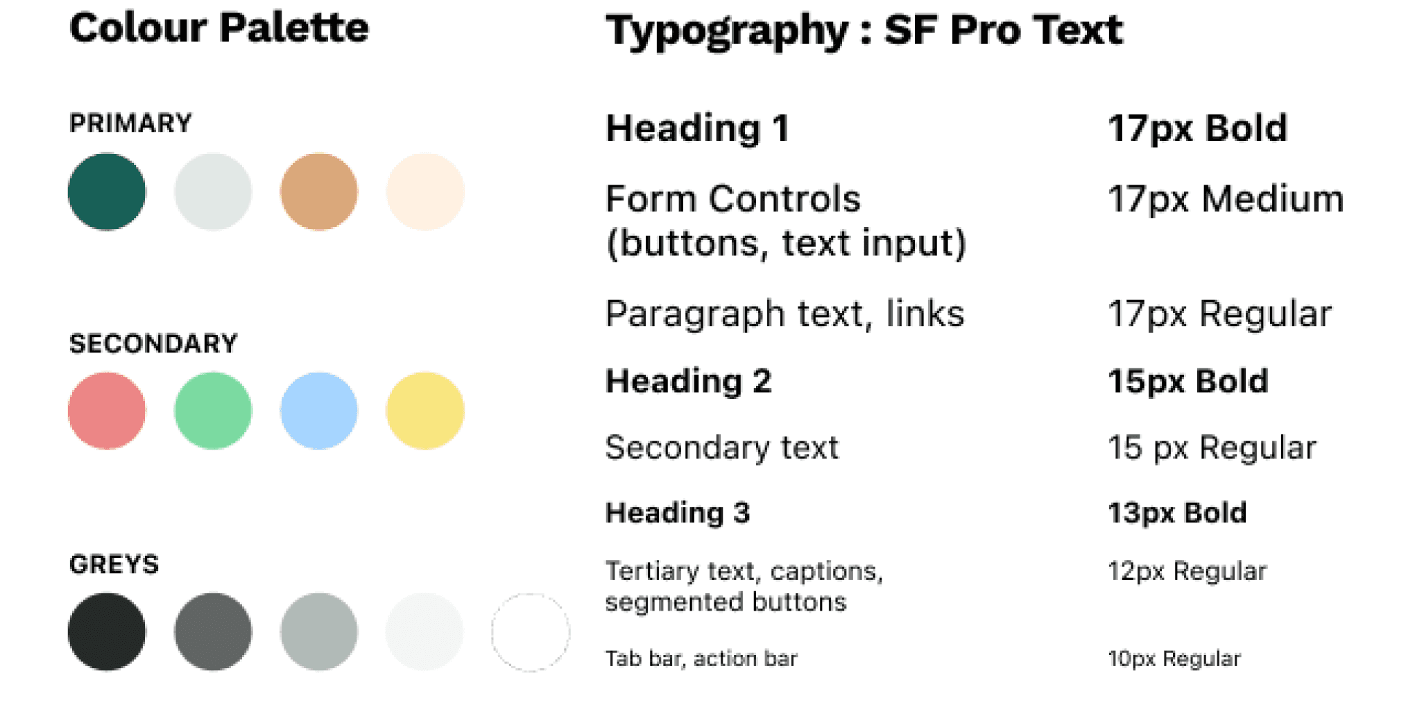
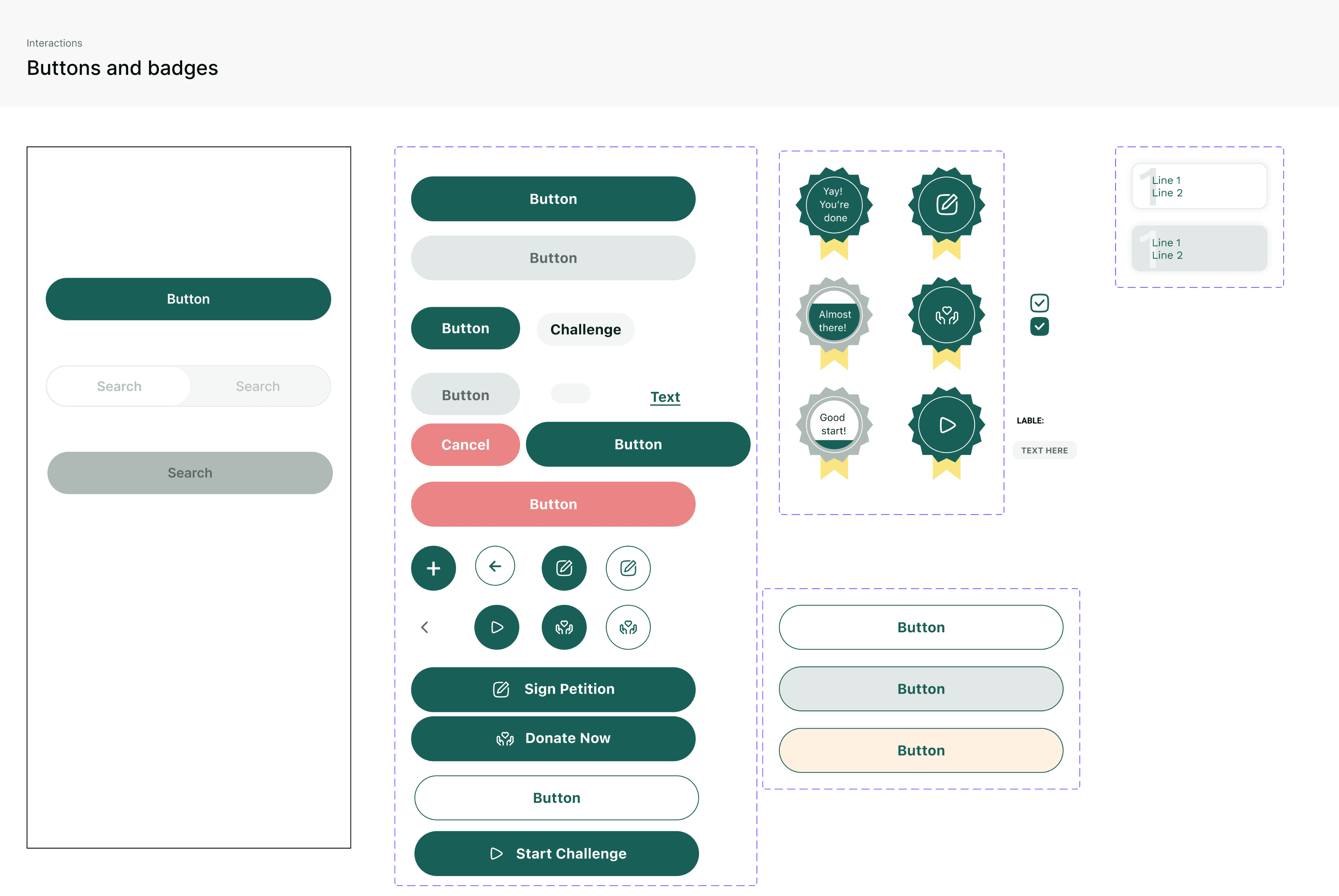
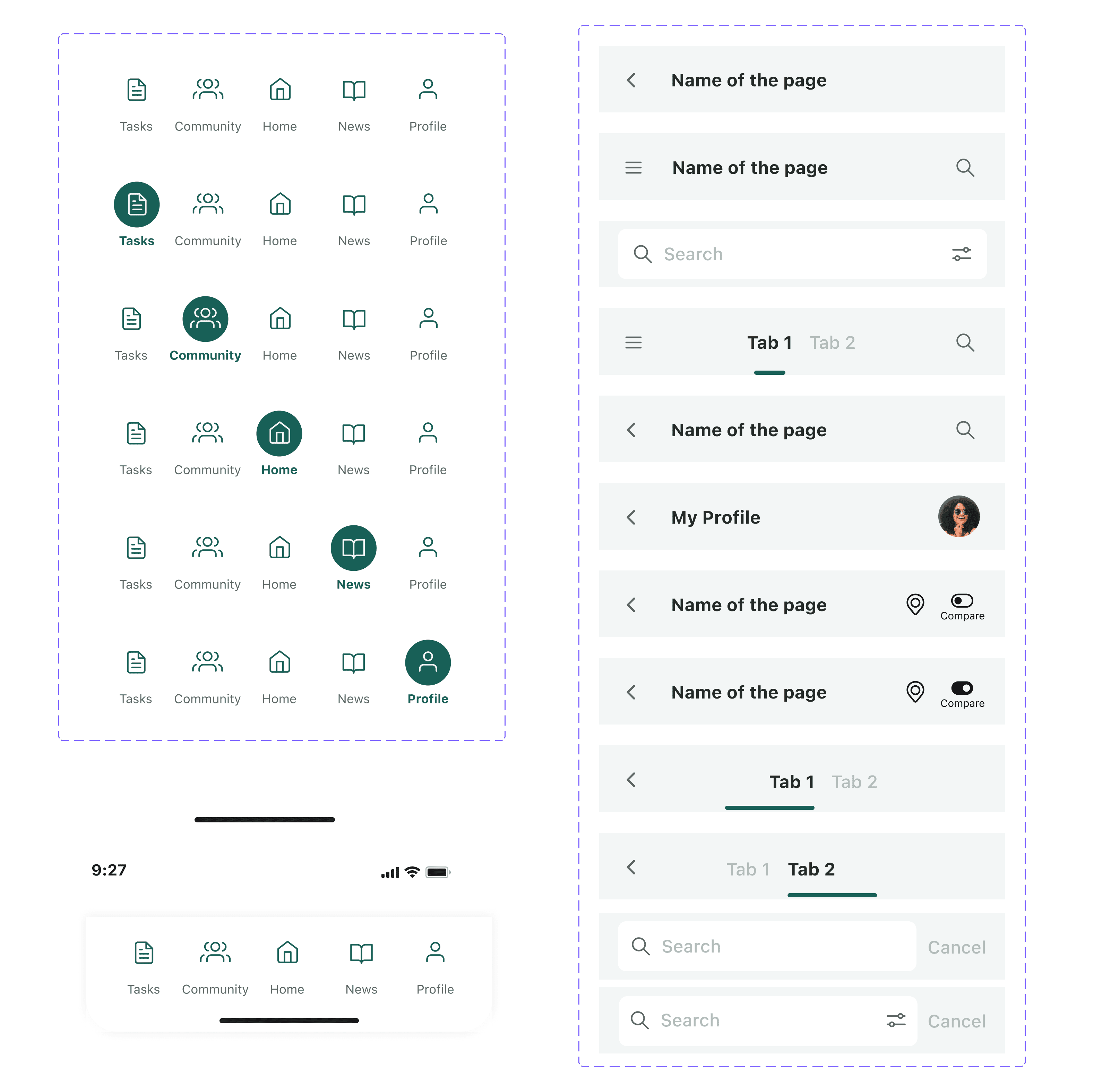
To create a cohesive user experience the next step into the design process, we created a style guide and design system. This helped us maintain consistency in our designs even with multiple designers working on the file.
Style Guide
Design System
User Testing and Iterations
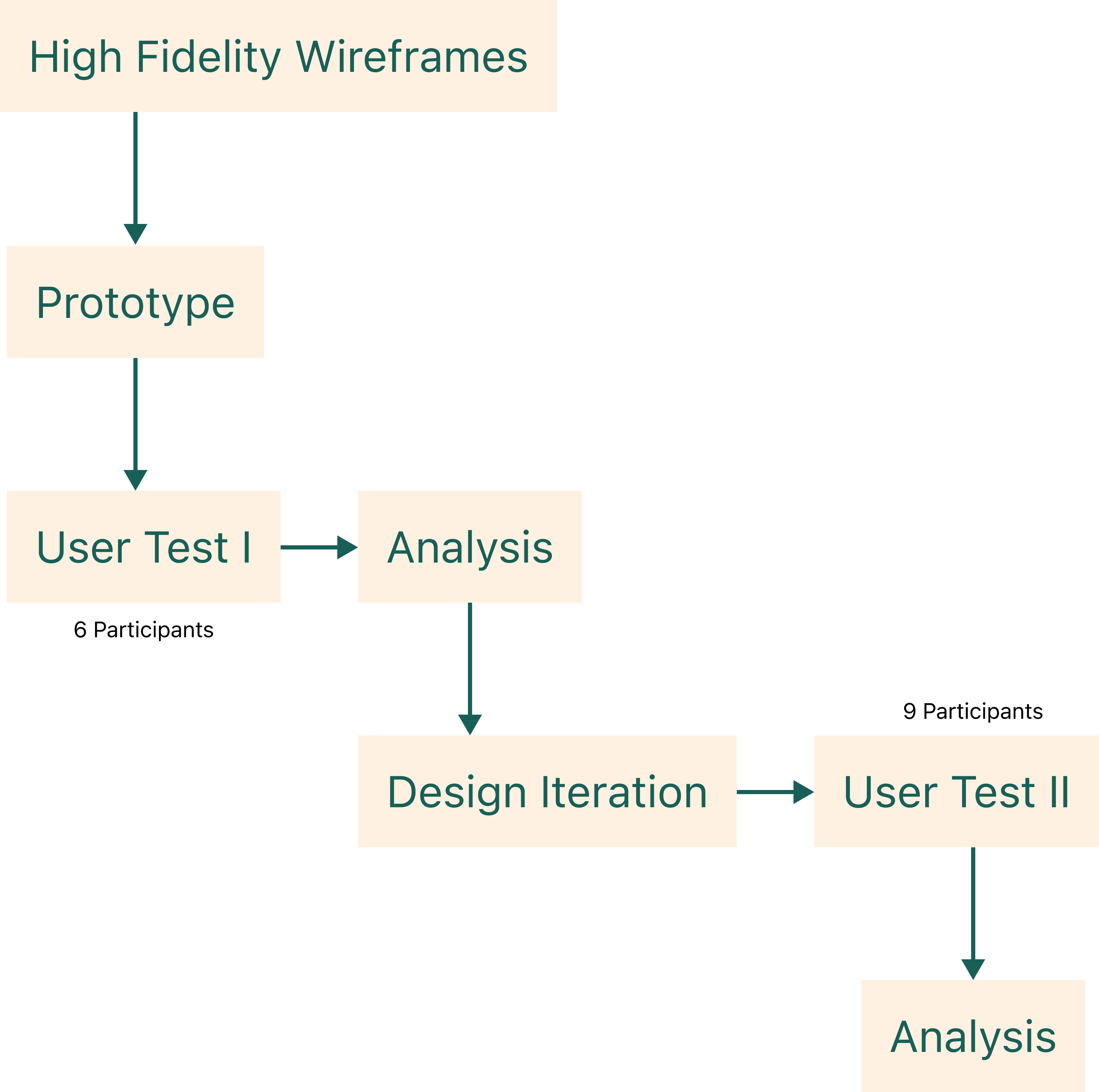
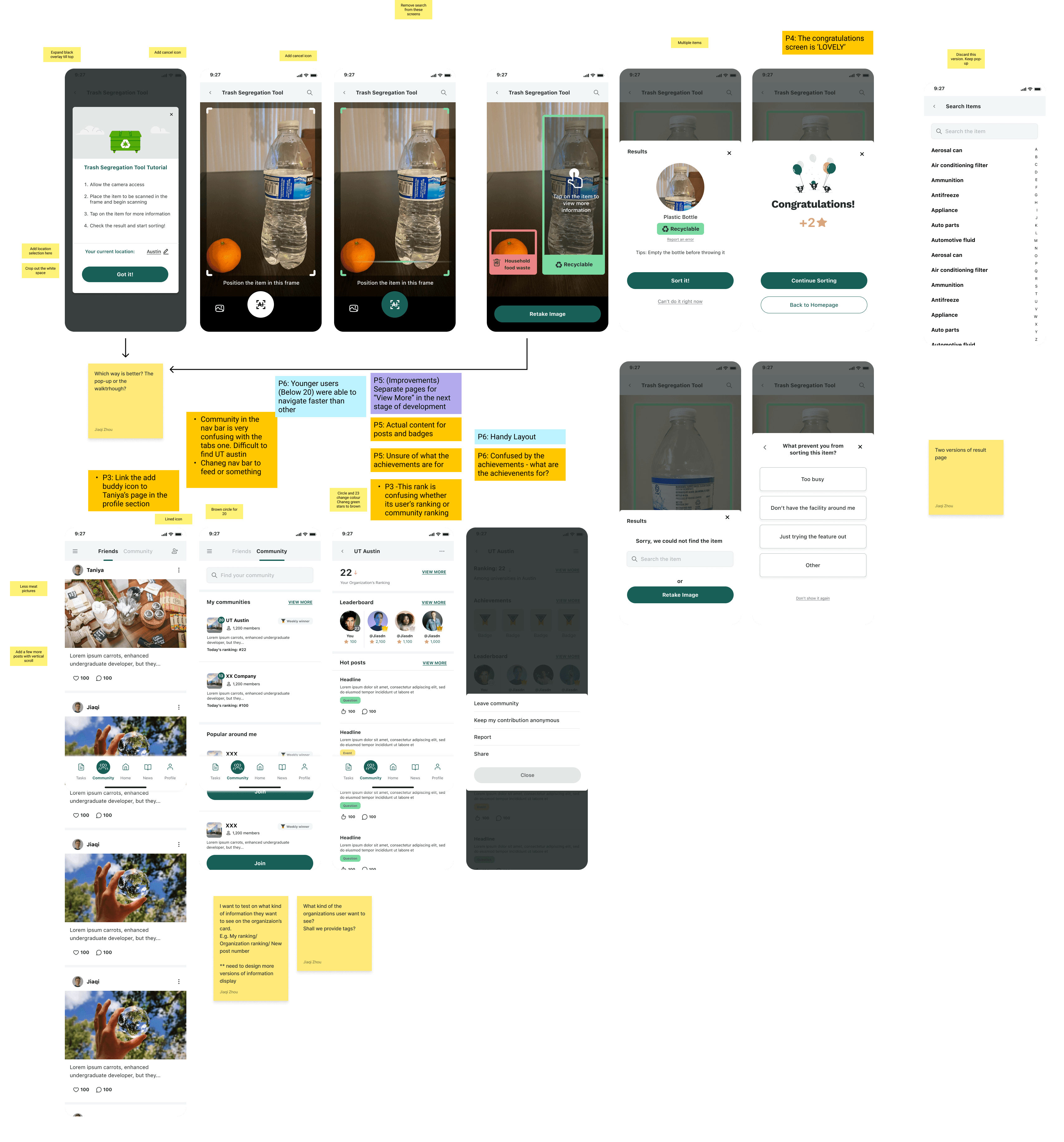
We conducted 2 user tests other than the pilot test. The first test had 6 participants from usertesting.com. We gave them a total of 9 tasks to complete on the prototype and each of these tasks were followed by 2 questions:
-> Did you complete the task successfully?
-> How difficult was it to complete this task?
The overall test was followed by retrospective questions:
What frustrated you most about this app?
If you had a magic wand, how would you improve this app?
What did you like about the app?
How likely are you to recommend this app to a friend or colleague (0=Not at all likely, and 10=Very likely)?
We received varied responses by the people and added design iterations which would add a better overall user experience.
For the second user test we had 9 participants from usertesting.com. The second user test was conducted for two reasons:
We wanted the people to explore more elements of the application.
We wanted to test if the iterations we made helped make the overall prototype easier to use and create a better user experience.
Before

After
Before
After
Learnings and Future Scope
Working on this project taught me:
Share-n-learn atmosphere considering the varied backgrounds of team members
Importance of the iterative process
Advantages of the in-person group sessions
Interpersonal and intrapersonal growth
Attention to detail
Following are a list of features that we would like to incorporate in the next design stage of Ecowin:
Sustainable Products
Trash Segregation
Community
Carbon Footprint calculator
Tasks
Smooth linking with other websites
Collaborate with organisations
